Golden Age of Art Bookplates
Near the turn of the 20th century, Russia had a golden age of book design. It is traditionally associated with members of the World of Art group. The most prominent names include Boris Kustodiev, Konstantin Somov, Mstislav Dobuzhinsky, Ivan Bilibin, Yevgeny Lanceray, Anna Ostroumova-Lebedeva, Alexandre Benois, Leon Bakst.
A book was considered a work of art. All the book's elements, from the title page to tail pieces, worked together to convey an artist's intent. Bookplates and printer's marks also played an important role in the book culture at that time. These small pictorial forms, fully represented in our Prints Collection, were especially loved by artists of the World of Art group. At the end of the 19th century, the traditional heraldic ex libris fell into a decline. A radical new style of the bookplate was required. Artists expressed their ideas by symbolic or allegorical graphic miniatures.
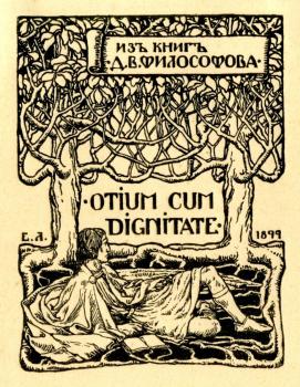
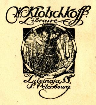
Among the members of the World of Art group, Yevgeny Lanceray pioneered the innovations in bookplate artistry. His early works show the influence of foreign masters, which reveals itself in the well balanced composition, elaborate vegetal patterns, silhouette images. For instance, English influence obviously affected the bookplate of D. Filosofov. The bookplate of the rare book seller V. Klochkov is more original.
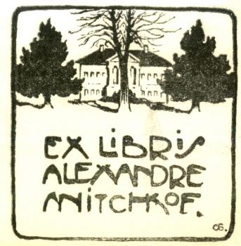
The free associative form of the bookplate attracted not only graphic artists, but painters such as Osip Braz. Anichkov's ex-libris is designed by him as the nice combination of silhouettes and lines. It is very expressive but laconic.
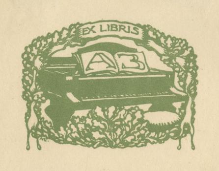
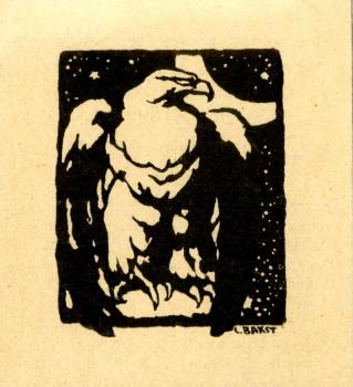
A peculiar bookplate in the shape of a vignette was initiated by Leon Bakst. The only ex libris of his work perfectly matches the impression of "bookishness", thanks to the elegance of graphics, delicate drawing of the initials placed in the open music book on the piano, and the plant ornament.
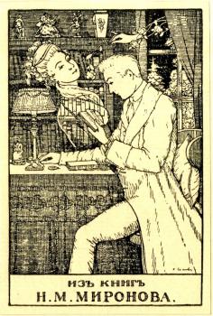
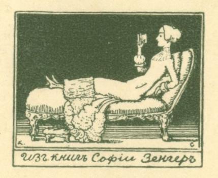
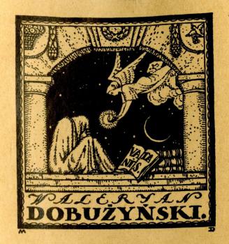
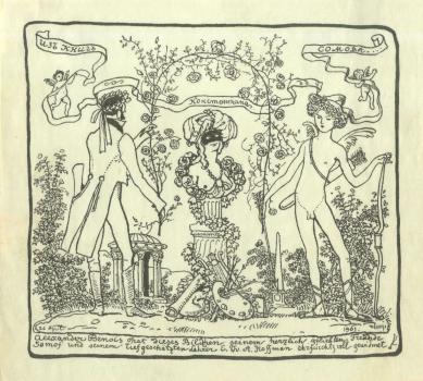
This new form of a vignette was taken up and used in their ex libris by other masters, Konstantin Somov and Mstislav Dobuzhinsky. Konstantin Somov created ornamental decorative bookplates, with a tinge of sensuality, which is characteristic for all his works. The bookplates of N. Mironov, S. Zinger, A. Benois are made by the artist in a light, refined style. They are filled with sweet nostalgia for the bygone times.
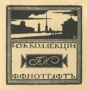
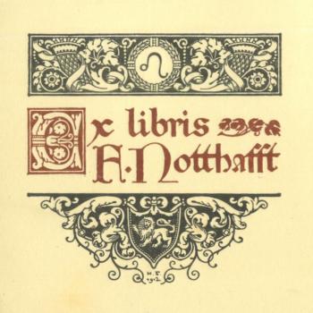
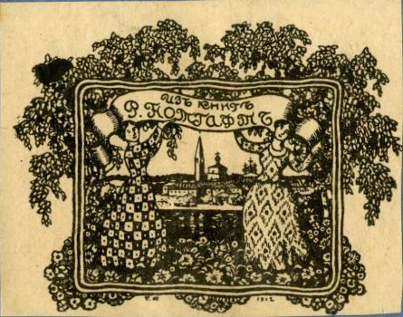
Bookplates by Mstislav Dobuzhinsky are more ponderous, they have silhouette images and an ornamental frame. A typical example is the ex libris of F.Notthafft, his late work.
Alexandre Benois developed another form of a bookplate. This is a so-called "presentation", large version, complicated with narrative elements. Thus, K. Somov's ex-libris closely resembles a a virtuoso airy illustration of a big size, with the book-owner's name which is essential for a bookplate.
Bookplates by Ivan Bilibin also do not display a concise style, usual for this art form. The ex libris of R. Notthaftt can be compared to a picture from a magazine. Like other works by Bilibin, it is distinguished by the strict graphic design, the symmetric composition, the elaborate script.
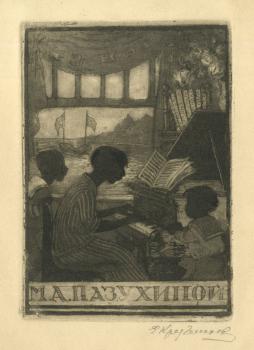
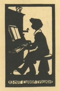
Bookplates by Elena Kruglikova are produced in a variety of techniques. Sometimes they look like fine prints: M. Pazukhina's bookplate as if transports the viewer into a cozy home world. The silhouette ex-libris of E. Shokhor-Trotskaya has a totally different character. Its dynamic composition is built on the contrast of light and shadow. The bookplate is decorated with plain ornaments.
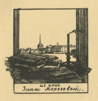
Working in the technique of woodcut, Anna Ostroumova-Lebedeva often created views of the grand architecture of St. Petersburg. These images, such as Z.Morozova's bookplate, are distinct and rather cold, but surprisingly harmonious.
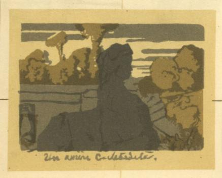
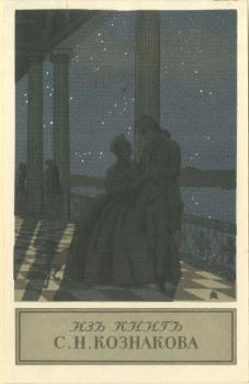
S.Koznakov's bookplate is an interesting stylization common to the works of the World of Art association. Like the expressive bookplate of S.Lebedev, it is executed in colours with a variety of natural ornaments.
Not only the theme and floral ornaments but all artistic choices by Boris Kustodiev link F.Notthafft's bookplate with typical artworks of the group.
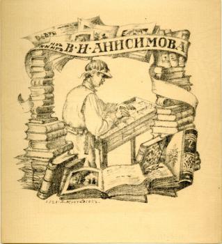
His later bookplates are further complicated: they increase in size and resemble head-pieces. The ex libris of the publisher V.Anisimov is unlike any other. A human figure perpectly incorporated into a decorative frame made out of piles of books.
Dmitri Mitrokhin is one of the most outstanding figure of the later generation of the World of Art. His early bookplates, as L. Zheverzheyev's ex libris, were inspired by Konstantin Somov, Alexandre Benois, and Mstislav Dobuzhinsky. Their favourite subjects are very similar: open books, writing materials or scattered flowers and bouquets within a rectangular frame. His mature bookplates became very sophisticated. These are asymmetrical balance works with highly dynamic scenes. Elements of the image have the appearance of runing off the edge. Text is also not centered in the frame.
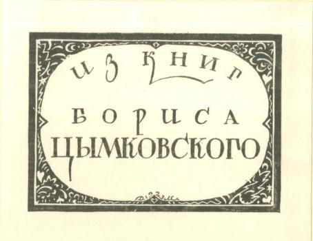
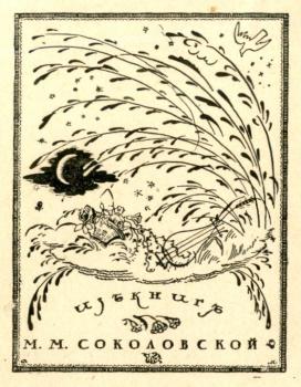
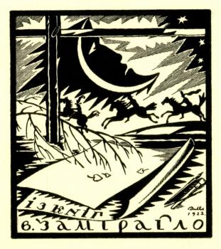
At the same time, traditions of the World of Art are still strong in the bookplates of M.Sokolovskaya and V.Zamirailo. They reveal themselves in the subject motifs, and in fine workmanship. In some bookplates such as B.Tsymkovsky's one, Dmitri Mitrokhin focused attention on the script: the shape, size and style of letters.
The splendid graphic artist Sergei Chekhonin started his art career with bookplates, created in the spirit of the World of Art. His early works have many decorative elements, rich ornaments of flowers and herbs. Bookplates for F.Sedenko-Vityazev and E.Gollerbah, similar in composition to Dmitri Mitrokhin's works, are harmonious and expressive.
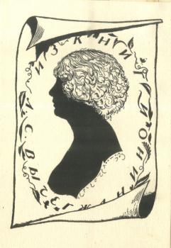
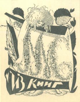
Bookplates for L. Vychegzhanina and M. Sokolovskaya illustrate a new stage in the artist's art. The first is very laconic: it shows a delicate balance between light and darkness, and an impeccable drawing of lines. The bookplate of M.Sokolovskaya is decorated with beautiful vegetal ornaments. It is easily recognized by "Chekhonin's" flowers and leaves.
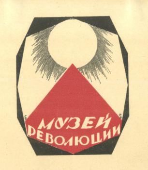
Sergei Chekhonin later departed from traditions of the World of Art. He aligned himself with the avant-garde and produced the Soviet attributes. The artist changed a chamber style into publicistic. Strict geometric decoration, large deformations, a dynamic design are typical for his late bookplates. The dramatic Bookplate of the Museum of the Revolution combines all these features.
It is hard to overestimate the impact of the artists of the World of Art group on the bookplate. They first elevate it to a high art. New, free-form bookplates of the World of Art rank among the greatest achievements of graphics.
Russian artists' venture into printer's devices also began at the turn of the twentieth century. The members of the World of Art group invented new forms for printer's marks as well as for bookplates. Logos first became an author's works. They reflected both a publisher's orientation, and an artist's individual style. The artists started with the magazine published by the World of Art association from 1899 to 1904, and the catalogues of the group's exhibitions. Logos for the magazine were made in different years by Leon Bakst, Yevgeny Lanceray, Dmitri Mitrokhin, Sergei Chekhonin.
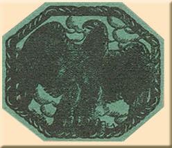
It is interesting to compare two logos of the same magazine. The earlier work by Leon Bakst is elegant and expressive. The later piece by Yevgeny Lanceray is a monumental and imposing, it emphasizes the importance of the publication.
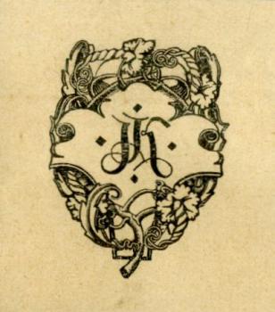
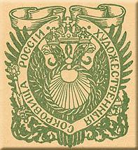
For the Moscow publisher Joseph Knebel, Yevgeny Lanceray produced a masterly composed device with publisher's initials enclosed within floral ornament. The logo of the almanac Artistic Treasures of Russia is somewhat old-style, but filled with movement and flexible forms. The printer's mark of the Cosmos Publishing House is distinguished for its asymmetric design and the art of the silhouette.
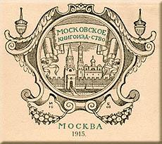
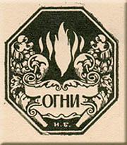
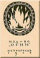
The elaborate logo of the Moscow Publishing House by Ivan Bilibin has lots of architectural details and elements. His printer's mark for the Ogni (Fires) Publishing House is also an intricate design. In contrast, the logo of the Ogni by Dmitri Mitrokhin is uncomplicated and provides only the essential details.
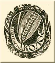
The Kolos (Ear) Publishing House that operated from 1918 to 1926, ran a special contest for its printer's mark, in which Dmitri Mitrokhin participated. The concise logo of his work is distinguished by grace of graphics.
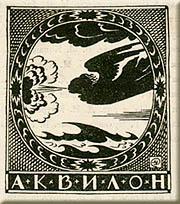
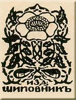
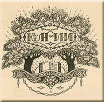
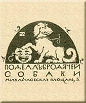
Dobuzhinsky's works are rightfully considered to be classical world-artistic compositions, harmonious and expressive. Take for example marks of the St. Petersburg publishers Aquilon (North Wind) and Shipovnik (Dog-rose), the emblem of the Society for Lovers of Russian Fiction and the logo of the Stray Dog Café which was a meeting place for famous writers and poets.
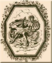
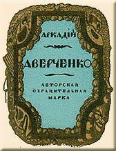
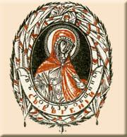
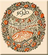
Printer's marks by Sergei Chekhonin show exquisite skill and inventiveness, elegant calligraphy and refined patterns. His early works, such as the Arion trademark, are similar in composition to bookplates. More interesting are the colourful copyright symbol of the writer Arkady Averchenko and the priner's mark of the St. Eugenia Community. In the post-revolutionary years, the master's works are saturated with movement and bright colours. They become more catchy, as for instance, the Communist International logo.
Printer's marks as a form of art did not exist for long: in the late 1920s all private publishers were closed, and the single State Publishing House was established, with its own logo. The universal style of Soviet printer's marks inherited litlle from traditions of the World of Art.
N. Melnikova
