Design of Soap Wrappers in Leningrad in the 1920s–1930s
Graphic Design
Unknown Artists
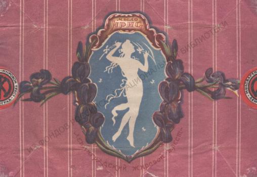
In the second half of the 1920s, simple toilet soap, like laundry soap, was sold without packaging, while luxury soap could even be wrapped in silk fabric64. Some toilet soaps were packaged in metal boxes. Between these extremes were the bulk of varieties for which paper wrappers were artistically designed.
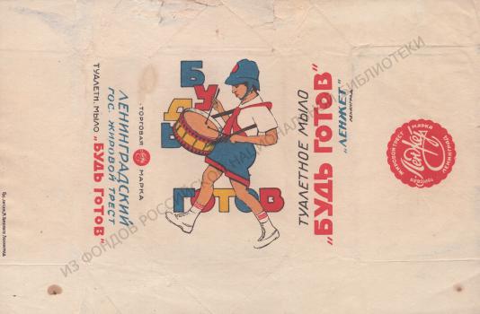
In the 1926/27 business year, a newly equipped production of toilet soaps was opened at the Nevsky Stearin Plant (annual capacity - 9,000,000 dozen65), and their general assortment at the LenZhet trust reached 90 items. For the first time, soap began to be produced at a cost of 15 kopecks per bar: according to the 1928 price list, these were four varieties of medical soap (a type of toilet soap, distinguished by the addition of medical ingredients) and eight varieties of “wrapped” toilet soap. But only one of the cheap soaps paid tribute to the era of building socialism – Be Ready (the motto of young pioneers)66. The Leningrad wrapper was more original than the Moscow one (the capital's TEZHE trust produced Pioneer soap), the composition dynamically combined the figure of a moving drummer in a red tie and the font of the inscription – the motto of young pioneers.
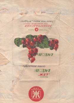
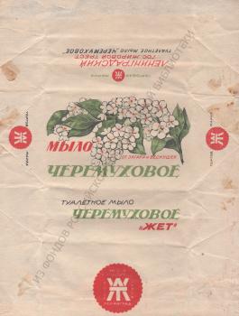
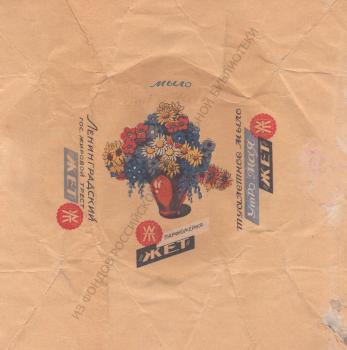
The wrappers of other soaps in the same price range feature realistic images of fruits or flowers: along with the already with the already mentioned Apple, these were Currant Berries, Bird Cherry and others. The graphic design for "Berries" and some other soaps were registered in the name of the LenZhet trust in January 1928; for a period of three years, but they were developed for the Zhet trust, that is, no later than 1927.
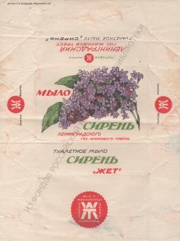
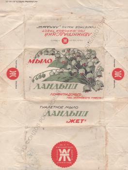
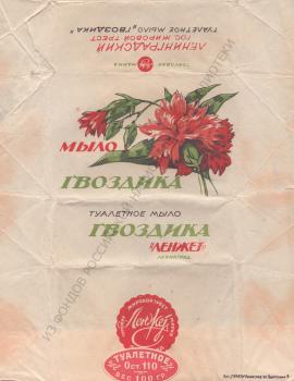
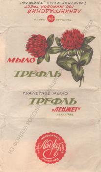
Wrappers of toilet soap that cost 5 kopecks more – 20 kopecks per piece – also featured simple drawings of flowers or branches that corresponded to the title of the product: Lily of the Valley, Lily, Lilac, Carnation, Pine, Trefle and others. To print some of these wrappers in 1927, the Zhet trust used the services of the former chromolithography of E. I. Marcus, which became the lithography of the Leningrad Tobacco Trust (10th line of Vasilyevsky Island, 57).
Probably, graphic artist and art theorist Gleb Goroshchenko once complained about such drawings, …Due to ingrained habit, many economic managers demand a three-dimensional visual solution in packaging, referring to its supposed “understandability.” and profitability. <…> The requirement of three-dimensional space … is … spirit of a refined, decorative approach to things, … designed for the petty-bourgeois consumer, as well as for the backward strata of the working people.” 67, it is also based on the idea that the “two-dimensional method of solving space, due to its “conventionality,” inaccessible to the peasant"68.
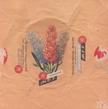
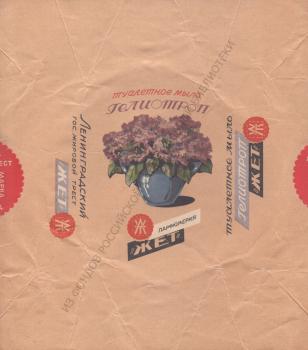
Wrappers of even more expensive varieties – 25 kopecks per piece – also often depicted floral designs, but not on a white, but on a colored background. The choice of titles also claimed greater sophistication compared to the “apples” and “berries”: “Heliotrope”, “French Hyacinth”, “Morning of May”.
The artist and writer Boris Sergeevich Zemenkov in 1930 wrote about the “area of labels, wrappers, packaging”, “The power of their influence on our taste lies in their multiplicity. … A number of graphic images of the thousands of things that surround us gets into our mind, often unconsciously. <…> People who are artistically immature usually accept these forms of graphic art with complete confidence. <…> Therefore, the design of everyday items must be made with increased quality requirements and with extreme care. After all, it is these forms of graphics that the growth or decline of mass taste depends on, because they are the first stage of communication with fine art, the foundation on which will be built one or another level of perception of art in the future. In our social conditions, the area of labels and wrappers is undoubtedly the most responsible area of graphic art" 69.
In the second half of the 1920s – early 1930s works of industrial graphics were displayed at exhibitions 70, their advantages and disadvantages were analyzed, biasedly considering the use of "such an amazing tool as a label"71. The press spoke of the need to “create our Soviet label, which "should reflect the pathos of the struggle for communism, the heroism of socialist construction, and the task of changing everyday life."72.
It was emphasized that the new artistic wrapping or packaging is in no way intended to hide a defective product. The task of the label – not only and not so much in product advertising; it was required to have a political, agitational, educational importance. The alert consumer, for his part, had to observe whether the designer was promoting an alien way of life, and, therefore, whether he was engaged in “artistic sabotage”. “Fight the propaganda centers of the philistinism!.. Tell us their names and deeds!”73, urged the magazine "Art and Masses".
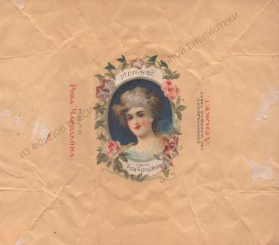
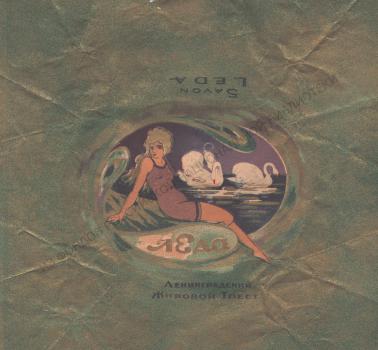
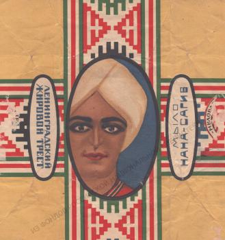
It was, of course, not the wrappers with drawings worthy of botanical atlases that caused the indignation of critics. In 1930 in the July issue of the magazine "Worker and Theater" published an article by the critic O. Kusakov under the eloquent title "Swamp of Vulgarity", … We still do not fully know this stagnant swamp of vulgarity. This is a system of the artistic policies of our trusts. The best example of this "artistic" policy is LenZhet's products. Some comrades claim that these products are not of the fat trust, as stated on the labels, but… greasy one. And it's true! The half-naked “Po d’Espani” and “Ledas” in bathing suits. There are a lot of theatrical plots depicted on wrappers. But it is clear to anyone who is not blind that the theater is far-fetched <…> – because the theater here is just an excuse for the greatest possible exposure of legs and other parts. <…> Are our trusts really competing in producing pornography? But isn’t it just vulgarity on wrappers? Don't we have … anything on the topic “Workers of all countries, unite”? But not so. Here is a very topical label for events in India: a portrait of a Hindu prince – soap “Nana Sahib” – LenZhet products… <…> Exotic is means of excitement for the jaded bourgeoisie. Our past has long been swept away, but the old, dirty tradition still lives on"74.
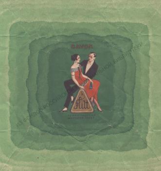
In black and white illustrations, the magazine reproduced six wrappers: one – for chocolate, five – for soap. Copies of four of them have been preserved in the collection of the National Library of Russia, thanks to which they can be seen in color. In addition to the Leda and Nana-Sahib soaps mentioned in the article, these were Flirt and Love me, which were also produced by the LenZhet trust.
The way O. Kusakov proposed to "drain the swamp of vulgarity" was to subordinate the art industry and product design to workers’ control through artistic and political councils, "By decree of the artistic sector of the Leningrad Council, Arts and Political Councils should be organized both at trusts and at enterprises."75. The idea of control was expressed then on the pages of other publications, "… Along with the existing political censorship, it would do well to establish artistic censorship. <…> Revision of wrappers circulating on the market, removal from printing of anti-artistic and outdated wrappers and replacement of illiterate drawings with drawings that are more artistic and more modern – such would be the task of this censorship"76. Judging by an article that appeared at the end of 1931 in the magazine “For Proletarian Art”, similar functions were obtained by the bureau of agitational-artistic packaging at the State Publishing House of Fine Arts (Izogiz), which was supposed to test both already issued labels and wrappers, as well as new ones, before they went to print 77.
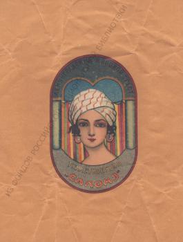
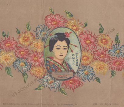
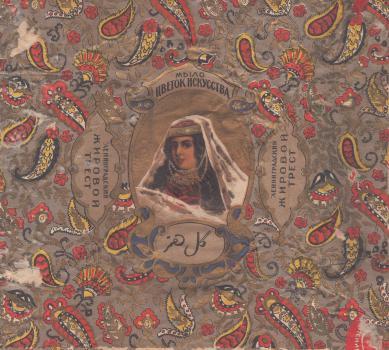
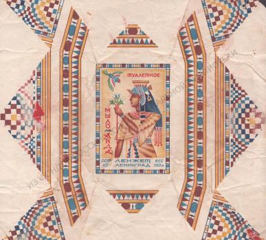
"…Soviet themes are generally neglected in wrappers"78, noted O. Kusakov. But it would be easy for him to continue the exotic series using the example of the products of the LenZhet trust: Salome, Flower of Art, Geisha (in relation to the last wrapper we can recall the words of the critic Vladimir Trenin, made in 1928, about perfume titles, which “characterize a woman exclusively as a bed accessory”79).
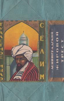
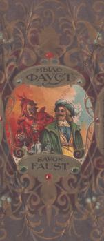
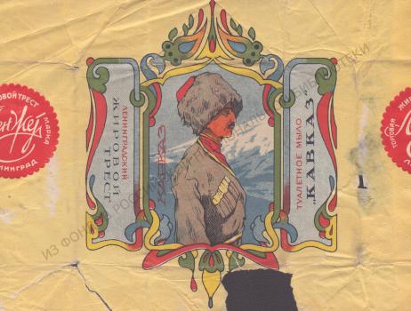
"Exoticisms" and "orientation towards great art"80 (expressions of V. V. Trenin) can also be seen in the design of the trust wrappers, addressed to male images: Selim, Caucasus, Faust. Criticism of the ideology of applied graphics was heard constantly at that time. G. T. Goroschenko wrote, "Observing our modern label and packaging products, it should be noted that they are still very much influenced by bourgeois-philistine ideology. Tendencies hostile to the proletariat in this area are expressed in the fact that <…> packaging is often used more or less disguised, or even completely openly, to promote clearly anti-Soviet ideas. <…> Glorification of bourgeois comfort, luxury, possessiveness, idealization of the past are usually found on our packaging"81.
Miron Roslavlev, professor of the Leningrad Higher Art and Technical Institute (VKHUTEIN, former Imperial Academy of Arts) and head of the Design Bureau created at the institute, in 1927 drew attention to the specifics of working on the design of traditional goods, "... Transforming types of products familiar to old consumers in terms of modernity is very delicate and responsible, and in this regard, the graphic artist must take into account the demands of the new consumer. Even if they are often primitive and grown up with the old “sweetened” motives, but the artist must instill new tastes and artistic needs through careful, methodical education. Only then he will achieve his goal when his products are attractive and understandable to the consumer, on the one hand, and will improve his artistic culture, on the other"82.
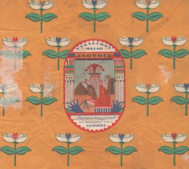
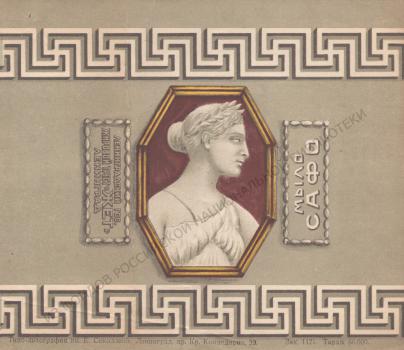
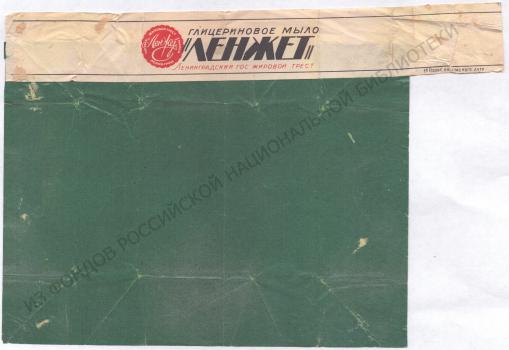
In some wrappers of the LenZhet trust, we can see not so much the demands of the "new consumer" as the influence of modern cultural trends and events. Thus, “Aida” and Lotus, which at first glance were in line with the usual exoticism, at the same time, they fit well with the passion for Egyptian art characteristic of the Art Deco era. Sappho can be related to the neoclassicism of the 1920s-1930s, and in the laconic wrappers of LenZhette glycerin soap, the trend of non-objective art is felt.
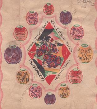
The appearance of the «Red Poppy» soap was influenced by the ballet of the same name by R. M. Gliere: its Moscow premiere took place in 1927, followed by theater productions in other cities, including in Leningrad in 1929. According to researchers, the image of the ballet “Red Poppy” was widely used in popular culture, so that it is already"impossible to determine what exactly was inspired by ballet and what was an echo of the widespread use of this decorative element"83. As culturologists O. S. Sapanzha and N. A. Balandina state, "“Red Poppy” gave rise to a whole series of unexpected interpretations. Porcelain painting and small plastic art, postcards and stamps, embroidery and textiles, sweets, and, finally, the chain of cafes and restaurants “Red Poppy” presented a work of choreographic and decorative art in replicated images that filled the space of the house and the city. It is quite natural that fashion also responded to a striking event in cultural life: clothing in “Chinese” fashion. taste, interest in floral patterns with poppy motifs and, finally, one of the iconic Soviet perfume compositions – perfume “Red Poppy”84.
The perfumes mentioned by the authors were produced by the Moscow TEZHE trust. The graphic design for their box was registered on February 20, 1930, at the same time as the powder box, while the cologne box was registered earlier on November 12, 192985. The LenZhet trust registered its design, intended for use on packaging for cologne, perfume, powder and soap, almost simultaneously with its competitor – on January 3, 193086.
Toilet soap D. L. K became a response to an event of a different kind. On November 3, 1927, on the occasion of the 10th anniversary of the October Revolution, a department store of the House of Leningrad Cooperation (DLK) was opened in the building of the former trading house of the Guards Economic Society87. DLK commissioned a toilet soap, the wrapper of which depicted the building of a store on the corner of Zhelyabova Street88 and Volynsky Lane. It also featured the emblem of the Leningrad Union of Consumer Societies ("LSPO"), and the Soviet emblems – sickle and hammer served as a background.
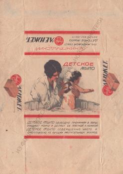
The claim that, unlike bourgeois packaging, "the task of our packaging, in addition to its main purpose – preservation of the item, is a demonstration of the true quality and features of the product"88, can be illustrated by the wrapper of Baby Soap. It shows a mother bathing a baby, soaping his back and head; on the sides of the wrapper are images of an unpacked bar of Baby Soap. The visuals are complemented by text that convinces the buyer of the benefits and quality of the product, "Baby soap, freely penetrating into the pores, cleanses the skin and makes it soft and tender. Baby soap is completely pure and made from the best vegetable fats." Developed no later than 1927, the design continued to be used until the mid-1930s, only information about the manufacturing trust changed.
As G. T. Goroschenko argued, "Soviet wrappers should widely promote the idea of using their goods, being a powerful ideological factor in the field of reorganization of life and consciousness of the working people"90. In light of that statement, the wrapper of "Baby Soap" fits well into the system of measures for sanitary and hygienic education, which at that time became part of the state health care system.
