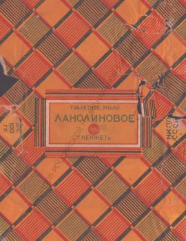
Design of Soap Wrappers in Leningrad in the 1920s–1930s
Graphic Design
A. N. Zelensky and Other Artists
The creators of the wrappers and labels remain unknown in many cases. A review of the 1st All-Union Exhibition of Soviet Applied Graphics stated in 1963, "… Museums and other repositories collect this material not systematically, but occasionally. Applied graphics as an art is usually not given much importance. This fact is evidenced by the destruction of most of the originals during the production process. It is also abnormal that works of applied graphics very rarely contain the artist's name" 91.
On the back of some of the soap wrappers of the LenZhet trust from the collection of the National Library of Russia, the names of the artists are written in pencil. Unfortunately, it is impossible to determine who made these inscriptions. The sources of acquisition of most wrappers in the Library are also not traceable, except those dating 1924. Their condition suggests they were first used to wrap bars of soap and then preserved by an unknown collector.
Most of the wrappers are attributed to Alexander Zelensky, one of the "most active industrial graphic artists of Leningrad"92. There is every reason to believe this attribution: A. Zelensky was the main artist of the Leningrad Tobacco Trust since 1922 before his move to Moscow in 1929. At the same time he worked for the Leningrad Fat Trust – at least he represented these two organizations in the committee of the exhibition "Graphic Art in the USSR. 1917‑1927"93.
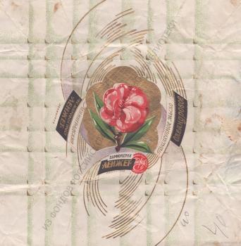
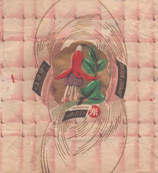
A. Zelensky's works are very diverse, they can be divided into several groups. Geometric patterns of delicate, melting shades serve as the background for wrappers of expensive Oleander and Salute to Spring soaps costing 40 kopecks94. In the center is an image of a flower in bright, rich colors against the glittering gold. These wrappers, like a number of others, were made in the M. Tomsky Lithography (former Lithography of T. Kibbel). It is worth noting that the "Fat Trust wrappers and labels" were also among the exhibits presented by the company at the exhibition "Graphic Art in the USSR. 1917-1927" 95.
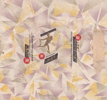
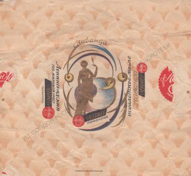
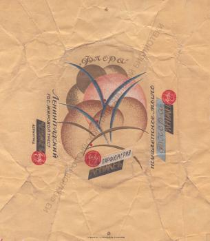
Another expressive technique is the use of embossing which creates a play of volumes and texture diversity. The Flora soap wrapper 96 shows the contrast of a smooth, evenly colored background and a central relief motif in which plant forms are depicted so generally that they look like a non-objective composition. In a similar way, the Lavender wrapper97 features a gold-embossed figure of a bather with a mirror in her hand. The flying deity on the wrapper of the cheaper Mercury soap is also highlighted in relief 98.
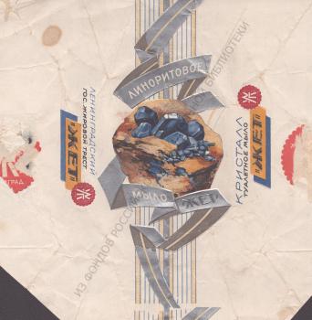
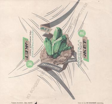
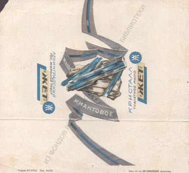
A separate group consists of soaps from the "Crystal" series, the wrappers of which depict minerals: Linorite (more correctly, "Linarite") and Titanite. To these you can add Kyanite on the wrapper of which the author is not indicated. The broken silver ribbons with the names of the soaps resemble the shape of crystals. This is further emphasized by embossing, and the white background enhances the color of the stones. A total of four "Crystal" soaps were produced. (Anorite is not available in the collection of the National Library of Russia), they were all relatively expensive and cost 40 kopecks per piece.
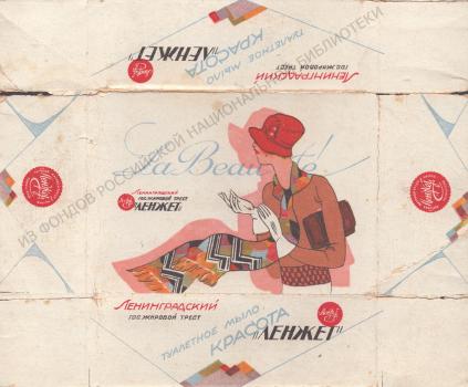
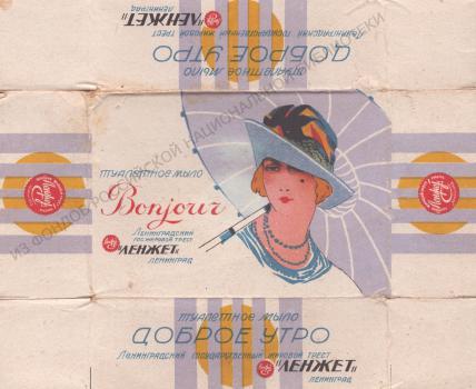
Box designs for La Beaute. Beauty and Bonjour. Good Morning soaps are notable for their modern graphic language. The plots are quite common for packaging of cosmetic products – a fashionable woman in a colorful scarf, pulling on white gloves, or a languid beauty with an umbrella on her shoulder. They are solved in the Art Deco style, characteristic of world art of the 1920s-1930s. Both soaps are in the "News!!! Latest New Products" section of the price list for 1928 and are advertised as "premium toilet soap in original boxes"; in terms of price, they were among the most expensive - 50 kopecks apiece.
The appearance of foreign words in the names of soaps is likely due to an event reported in the same price list.: «This year, the staff of perfumers and laboratory technicians has been strengthened by inviting the most experienced French perfumers to work, in order to fully satisfy the needs of our buyers. Along with items designed for the widest consumer, we manufacture products whose quality can easily compete with similar products from the best foreign companies and satisfy the most sophisticated tastes"99.
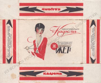
The Kadum soap was among the new products – expensive varieties in boxes – in the same section of the price list. Its name obviously refers to the French soap "Cadum", known since 1912 and received its name from the Latin name for juniper oil. In the mid-1920s, brand "Cadum" was advertised by famous Parisian artists, including – Jane Pierley; Perhaps she inspired the female image on the packaging of the Soviet perfume "Cadum" (the LenZhet trust produced not only soap under that name, but also cream and cologne).
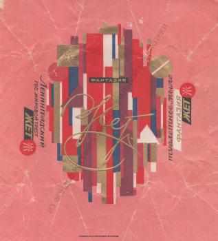
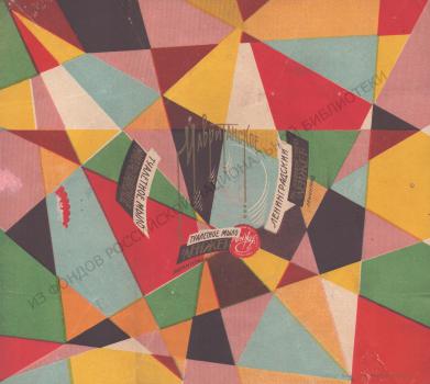
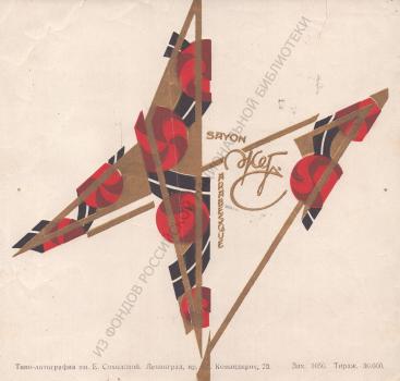
Another group of packaging is based on an abstract geometric composition, reflecting the influence of art from the first decades of the 20th century. In its multi-colored decorativeness one can see both the experiments of non-objective artists and the creative search of constructivists. These are Fantasy, Surprise, Moorish 100, to which you can also add the more expensive Arabesque 101.
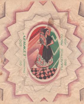
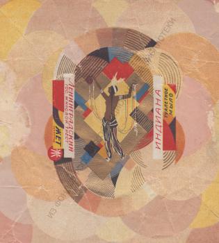
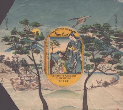
Exotic subjects, without which it is difficult to imagine the "perfume genre" (expression by V. V. Trenin), are also found on wrappers attributed to A. Zelensky. In Indiana, geometric shapes – circles, rectangles – serve as the background for the figure of a half-naked woman. Chio-San imitates the techniques of Japanese fine art. The first of these soaps in 1928 cost 30 kopecks per piece, the second – 40 kopecks. From an artistic point of view, packaging for more expensive varieties is much more interesting than packaging for varieties costing 15-20 kopecks – probably the LenZhet trust saw a direct relationship between the income of buyers and their ability to appreciate the merits of graphic design.
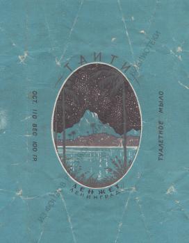
The wrapper of Tahiti shows a night landscape with palm trees. Probably, this soap began to be produced no earlier than 1929, since this name is not included in he price list for 1928. The copy stored in the National Library was printed no later than 1932. This can be concluded from the line "OST 110", which is an indication of the number of the all-Union standard "Toilet soap", which was in force from October 1, 1927. to September 1, 1932.
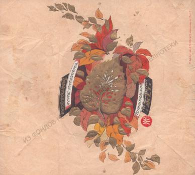
On the wrapper of Golden Autumn soap, wine-red, yellow, dull pink, golden leaves are scattered across a light, fawn background, as if caught by the wind. A large golden leaf with many holes is placed in the center of the composition; it is made by embossing. This design had a long life: the wrapper, known in variants with the trademark "Zhet" (1927) and "LenZhet", was used by the Nevsky Soap Factory until 1949. It is curious that the production standards recorded in the typewritten "Assortment of Toilet Soaps" specified the color of the oval bar of soap as "yellowish green," with a poetic explanation: "the color of withered greenery."
In 1935, the name of this soap appeared on the pages of the Pravda newspaper: on March 8, it reported a government decree to lower prices of all types of toilet soap; in particular, a bar of Golden Autumn premium soap should now cost 2 rubles 102. Seven years earlier, its cost was 30 kopecks, while for 25 kopecks you could buy another soap, the name of which included the same noble metal – «Goldfish».
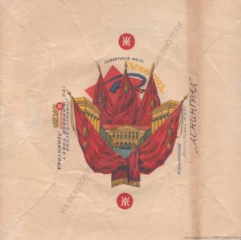
Leningrad soap wrapper 103 is notable for the use of Soviet symbols: the view of the façade of Smolny (headquarters of the local Communist Party apparat) is decorated with red banners, and a red star, sickle and hammer serve as a background. Since it is listed as "Leningrad-Jubilee" in the price list for 1928, we can assume that it was produced for the 10th anniversary of the October Revolution.
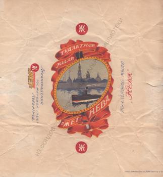
A. N. Zelensky is also credited with a wrapper of the more expensive soap, whose name is associated with the city of St. Petersburg in which it was produced: The Neva104. It depicts a tugboat going along the Neva river past the Peter and Paul Fortress – one of the most recognizable city symbols.
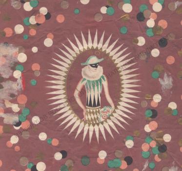
If A. N. Zelensky worked mainly on advertising and industrial graphics, then the names of other artists indicated on the wrappers from the NLR collection are primarily associated with the art of book design. Soap wrapper «Masque» («Mask»)105, produced by order of the Leningrad "Intourist" (the travel agency for foreign tourists in the Soviet Union), is attributed to Evgeniy Belukha (1889‑1943), famous for his book and magazine illustrations and bookplates.
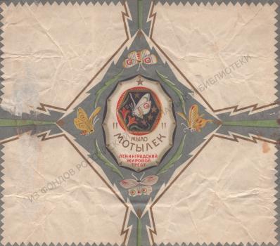
Nikolai Alekseev (1894‑1934) in 1923‑1926 studied in Petrograd – Leningrad at the graphic department of the Higher Art and Technical Institute (VHUTEIN) (former Academy of Arts). Around the same time, he worked on originals for trademarks, tobacco and perfume labels. The art historian and critic Erich Gollerbach wrote, "unfortunately, due to the intractable inflexibility of the trusts, not all of Alekseev's works were approved, and only a few were used. Among them were compositions that combined advertising brightness and memorability with successful graphic design"106. The artist created the «Moth» soap wrapper107. Dating back to 1926108 , it is made in muted colors and is built on a combination of large plain planes and small patterns, broken lines of ornament and smooth outlines of butterfly wings.
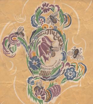
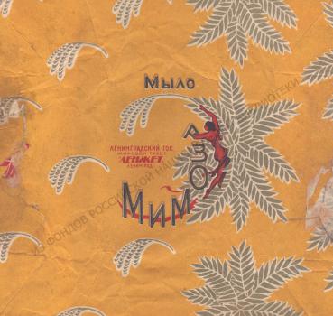
Unlike the strict Moth, the Bee soap wrapper109 is made in the form of a fancy ornament with intertwined flowers, honeycombs, bees, and a text font composition. It is attributed to one of the leading Leningrad graphic artists Leonid Khizhinsky (1896‑1972) who also studied at the graphic department of the Higher Art and Technical Institute. His name is also written on the back of the Mimosa soap wrapper110 – this drawing was registered by the LenZhet trust June 28, 1928111.
The catalog of the exhibition "Graphic Art in the USSR. 1917‑1927" included also "perfume labels"112 selected by L.S. Khizhinsky for it – six out of the twenty-five works he showed. Besides him, labels were exhibited by A. M. Litvinenko, O. L. Lyalin, S. M. Pozharsky113. The names of all these Leningrad artists, as well as E. D. Belukha and N. V. Alekseev were also listed by M. I. Roslavlev, who called their work in the field of industrial graphics, which was carried out for Design Bureau of the Academy of Arts headed by him, as"interesting attempts"114.
The illustrator and draftsman Efim Yakovlevich Higer (1899‑1955) also attended the former Academy of Arts (then the Petrograd Higher Artistic and Technical Workshops – VKHUTEMAS). A copy from the collections of the Nekrasov Central Universal Scientific Library (Moscow) allows us to consider him the author of the Rosita soap wrapper 115.
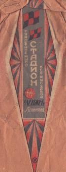
Special mention must be made of the soap Stadium, on the ornamental geometric wrapper of which – a rare case – there is a monogram of the artist: "SK". This is the work of Leningrader Sergei Korsakov (1886 - not earlier than 1972)who worked in the field of industrial graphics and posters for decades.
M. I. Roslavlev his article for the catalogue of the exhibition "Graphic Art in the USSR. 1917‑1927" began with the words: "The position of industrial graphics, its methods and breadth of application in Soviet Russia are still at a very low level.". He further emphasized that"… isolated attempts in this direction still do not improve the situation"116. Researchers of the 21st century also agree with him: as the doctor of art history E. Glinternik writes, the poster was the most prosperous area of Soviet advertising graphics. Other its forms were not distinguished by such novelty and artistic quality"117.
Although this evaluation is quite applicable to the design of the products of the LenZhet trust, it seems important to show examples of them from the collection of the National Library of Russia. Over ninety wrappers were selected for this electronic exhibition (a more complete collection is presented in the Digital Library). Thanks to them, information about the past of Leningrad enterprises is replenished and the pages of magazine polemics about the artistic face of our label come to life"118. Being an integral part of the history of Russian graphic design, these wrappers clearly demonstrate how artists more or less successfully solved the tasks "to introduce art into our lives"119 “to achieve maximum impressions with minimal means"120.

![Goldfish = Poisson d´or : [soap] Goldfish = Poisson d´or : [soap]](/ve/dep/artupload/ve/article/RA7577/MA70325/s_NA76071.jpg)
